In our world of internet marketing and advertising, landing pages are critical. Without a doubt, landing pages -- and the lead-capture forms that come with them -- are the most important elements of a marketing campaign; an online marketing campaign should never be started without first creating a dedicated landing page.
In the purest sense, a landing page is a standalone web page distinct from your main website that is constructed for a very specific purpose or goal. It is not meant to showcase a wide array of products, or to introduce a visitor to your company or service. Landing pages should not have a navigation to tie it to your primary website.
The sole purpose of a landing page is to capture a lead, sell a product, and/or provide a download and its success is typically measured by one statistic: conversion rate.
There are certain guidelines and techniques you should adhere to in order to maximize your page’s success and conversion rates (Our New Year's Resolution for 2015: Higher Conversion Rates). Here are 5 techniques that, when taken together, will very likely double your current conversion rates.
Landing page vs Homepage
Let's begin by first establishing what a landing page is not. The term “landing page” should not be used to refer to the homepage of a website. Your homepage is generally designed with a more general purpose in mind.
A homepage speaks about your overall brand (7 Tips To Building Your Brand Online) and is usually filled with links and navigation to other pages of your site. It’s designed to encourage exploration.
Landing pages, on the other hand, are designed for one purpose only. Read on for tips you should consider when creating stellar landing pages with higher conversion rates.
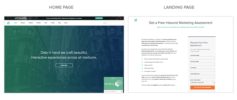
Never, ever use your homepage as your landing page
You should always make sure that you are sending your targeted traffic to a nicely crafted and targeted landing page instead of your cluttered homepage. Even if you have a "pretty" homepage, a campaign's traffic should be sent to your landing pages because they are specially designed to promote and convert, one offer at a particular time. Traffic should be directed towards this page and not a cluttered homepage that contains every offer and service that your company has ever had.
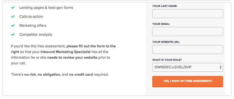
Provide one point of action to the visitor
One mistake marketers make is that they often include too much text. Every single word (and letter for that matter) on your landing page should serve a purpose, and that purpose should be to support your call to action. If it doesn’t do that, cut it.
Make it clear what you want people to do. If you want them to click on something, tell them to click on something. If you want people to call you, tell them to call you. Not only should you use appropriate wording for your CTA (call to action), but you should also ensure that it’s highly visible on the page.
Place it in a highly visible spot, like the upper right-hand corner of the page, and use a distinct color for buttons or CTA text so that it stands out from the rest.
Don’t give people too many options
If you make visitors think too much, or do too much, the more confused and distracted they will become. The more options you give a visitor on your page, the higher the resistance (friction) your visitors have to completing a task.
Friction has become a buzzword in the world of conversion rate optimization. Everyone wants to reduce it, but most don’t know where to start. Merriam-Webster dictionary defines friction as “the force that causes a moving object to slow down when it is touching another object” .
Your goal is to create a form that makes it easy for visitors to take action, and you can reduce such friction by making sure there are no sidebars, no footer, and just a minimal header. This focuses the visitor’s attention on the action we want them to take.
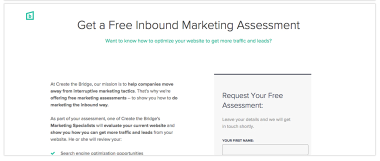
Less is more: Use an appealing, simplified look
Landing pages need to be greatly simplified compared to many other website designs with minimal text and images; any extraneous information that might distract your visitors and prevent them from converting.
White space is your friend.
Make sure to remove all inessential things like buttons or links in your website that are not related to your purpose. A simple, single-column design will most often do the trick.
A/B test and measure everything
A/B testing, the basis for optimization in online marketing, is an experiment where you test two different versions of a landing page simultaneously. Well-planned A/B testing can make a huge difference in the effectiveness of your marketing efforts and conversion rates.
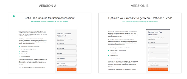
When it comes to conversion optimization, there are no hard and fast rules. What might have worked for one marketer will not necessarily work for you. The only way to validate your assumptions is to test.
Remember, you won’t ever know what your conversions can potentially be if you don’t test. Also, you won’t ever know what your conversions are if you don’t measure (find out which metrics every marketer needs to analyze). If you’re testing and measuring properly, you know when a landing page isn’t meeting your expectations.
The following are a few elements that you should A/B Test regularly:
- Headlines and header images
- Content in the body
- Form fields
- Images and colors
- Button sizes, text, and colors
Surprisingly, a dedicated landing page is often one of the last tactics put into play with online marketing efforts, if they are put in play at all. Every online marketer’s toolbox should contain landing pages as an imperative component. Including a simple yet inviting form on a landing page that prompts clients to include their contact information is an excellent way to create email lists using a landing page.
Therefore, by increasing paid campaigns conversion rates, high quality landing pages maximize the return on investment.
Are you including landing page design as part of your standard web design service? Don’t hesitate to contact our CRO experts if you have questions about landing pages or if you are looking for a search engine optimized website.