It’s my third month at Create the Bridge, to say that I’m learning a lot would be an understatement. Before I started my internship I had very limited knowledge of the industry. I’ve since asked many questions, read countless articles and blogs, followed along with tutorials and screencasts, and written some of my own code to practice.
After a couple months of this, it was time to take the training wheels off and jump on my first project: implementing a slide down nav bar. It seemed simple enough but for a green dev such as myself, there were some hurdles along the way. In an industry that advocates for the sharing of knowledge, I hope that by sharing some things I learned along the way will help other beginners.
Getting Started
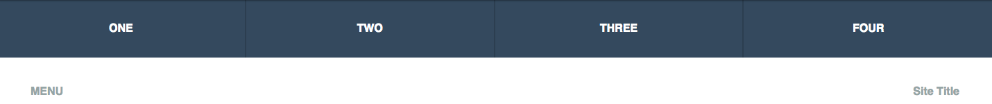
For this example, I’ll be using Haml, SCSS, and CoffeeScript to make things a bit more readable. First, a simple ul for our navigation links, and some links for our menu and site title:
%nav.top-bar-container
  %ul
    %li
      %a{href: '#'} One
    %li
      %a{href: '#'} Two
    %li
      %a{href: '#'} Three
    %li
      %a{href: '#'} Four
  .menu-items
    %h4.menu
      %a{href: '#'} MENU
    %h4.logo
      %a{href: '#'} Company Name
Let’s add some simple styling to get things going.
nav.top-bar-container {
  top: 0; left: 0; right: 0;

  ul {
    width: 100%;
    padding: 0;
    margin: 0;

    li {
      list-style: none;
      width: 25%;
      background: #34495e;
      border-right: 2px solid #2c3e50;
      box-sizing: border-box;
      float: left;

      &:last-child {
        border-right: none;
      }

      a {
        width: 100%;
        color: white;
        display: block;
        padding: 1.875em 0;
        font-weight: bold;
        text-decoration: none;
        text-transform: uppercase;
        text-align: center;
      }
    }
  }

  .menu-items {
    clear: both;
    padding: 1em 3em;

    h4 {
      a {
        color: #95a5a6;
        text-decoration: none;
        &:hover {
          color: #34495e;
          transition: 1s;
        }
      }
      &.menu {
        float: left;
      }

      &.logo {
        float: right;
      }
    }
  }
}
While I was toying around with styling this part, I was able to learn a couple new things. I had initially given most of the styling to the li elements but quickly realized this wasn’t the most efficient approach. By focusing on the li elements, the navigation links would only be clickable when hovering directly over the text, which would technically work but not be the most ideal. Instead, by giving the anchor tags display: block and some padding, the navigation links would now act as more of a button rather than a simple link.
Next came the challenge of getting the navigation bar to be responsive. I first approached it by giving the ul a width of 100%, and taking the border-right: 2px of the li elements into account, giving each li a width of 24.89%. Pretty solid logic, right? I confidently resized my browser window expecting a very fluid nav bar, but it quickly broke into two fragmented pieces and caused several more headaches for me. I tried several more fixes (some I am too embarrassed to even write about), but it still left me scratching my head for a bit. The fix ended up being very simple and obvious (as I’m quickly learning is the case with most fixes):
box-sizing: border-box;
To understand the way this CSS3 property works, we first have to understand how the box model works. If I had a div with a width of 300px, but then gave it 10px padding and a 2px border, at 100%, the true width of the div would now be 324px. If I were working with a fixed window size, perhaps my initial 24.89% would have worked (furthermore, I could’ve also written tons and tons of media queries, but that did not sound fun). However, if the parent div (window size) got wider, the nav bar wouldn’t touch the edges, and if the window was reduced, it’d cause the bar to spill out and break.
The box-sizing property, in all of its infinite wizardry, takes care of this by taking any padding and border into account and we can now use a nice and even 25% when declaring our width. Thus giving us a fluid navigation bar that looks great on any screen. Huzzah! For a more in-depth explanation of how this property works, check out this article over at CSS-Tricks.
Creating Hover Effects
As it is right now, our navigation bar is about 75% there. We’d still like to add some hover effects and get it to slide up and down on command. Let’s start with hovering. I used Hover.css, a library of CSS3 powered hover effects. Hover.css makes it incredibly easy to implement these effects, just copy and paste some code and give your li elements a class. For this example I used “underline reveal.” I assigned my li elements the class “hvr-underline-reveal” and tweaked the Hover.css code a bit to change the color of the bottom border, as well as the transition duration.
.hvr-underline-reveal {
  display: inline-block;
  vertical-align: middle;
  -webkit-transform: translateZ(0);
  transform: translateZ(0);
  box-shadow: 0 0 1px rgba(0, 0, 0, 0);
  -webkit-backface-visibility: hidden;
  backface-visibility: hidden;
  -moz-osx-font-smoothing: grayscale;
  position: relative;
  overflow: hidden;
}
.hvr-underline-reveal:before {
  content: "";
  position: absolute;
  z-index: -1;
  left: 0;
  right: 0;
  bottom: 0;
  background: #2c3e50;
  height: 14px;
  -webkit-transform: translateY(14px);
  transform: translateY(14px);
  -webkit-transition-property: transform;
  transition-property: transform;
  -webkit-transition-duration: 0.3s;
  transition-duration: 0.3s;
  -webkit-transition-timing-function: ease-out;
  transition-timing-function: ease-out;
}
.hvr-underline-reveal:hover:before, .hvr-underline-reveal:focus:before, .hvr-underline-reveal:active:before {
  -webkit-transform: translateY(0);
  transform: translateY(0);
}
Great. Now that we’ve got that working we can focus on getting the bar to slide down and up. To do this, I’ll use a bit of JavaScript to add a class when the “Menu” link is clicked. Before we write some JS though, first we should get the nav bar to be hidden when the page initially loads. To do this, I’ll use the property transform: translateY(-5.3125em) on the nav bar. All this does is move the object up or down (translateY) or sideways (translateX). By using a negative value, this will allow the nav bar to be out of sight when the page is loaded. We can give it a couple more properties to make sure it makes for a good user experience. position: fixed will make sure it stays visible as the user scrolls down the page, and z-index: 100 to make sure the nav bar is always at the top of the stack order so that other elements on the page don’t scroll in front of it.
We’ll have to create another class for when we want the nav bar to become visible. If we have transform: translateY(-5.3125em) to hide the bar, then our second class will simply declare transform: translateY(0) to make it visible. For some added oomph, let’s give both classes a property of transition: transform 0.5s, because we want a transition effect both when we open and close the nav bar. The final bit of code will look like so:
nav.top-bar-container {
  position: fixed;
  top: 0; left: 0; right: 0;
  transform: translateY(-5.3125em);
  z-index: 100;
  transition: transform 0.5s;

  &.open {
    transform: translateY(0);
    transition: transform 0.5s;
  }
}
CoffeeScript Wizardry
Now that we have all of our styling done, it’s up to JavaScript to add/remove the “open” class to our nav bar (this is written in CoffeeScript syntax).
$(document).ready ->
  $('.menu').click (e) ->
    e.preventDefault
    $('nav').toggleClass 'open'
Boom. We’ve got ourselves a nice little nav bar. A demo of it can be viewed here.
I’ll admit that piecing this together took a bit longer than I had hoped, but I’m quickly learning that there is no way around it. Sometimes the biggest annoyances ultimately lead to the biggest teaching moments. Luckily the dev community is built on a foundation of sharing knowledge and resources. I am excited, relieved, overwhelmed and sometimes even a bit terrified to be entering an industry that changes so rapidly and requires you to never grow stagnant. With that rapid change comes new challenges and room for growth, both of which I happily accept.