
Business owners it's your lucky day! We’ve developed a complete guide for you to follow when designing and building your website.
As a creative consultancy that primarily deals in working with small to medium businesses. We know from first hand experience how confusing it might be for business owners that are trying to create a website that'll truly benefit their business.
At the end of the day, you want to create a site that is successful with a solid return on your investment; whether that be on your time or money. This guide will walk you through a few elements you NEED to look out for when creating your site.
Let's dive right in and walk through each step.
Have a Great User Experience
There are a few elements in which make a website design truly effective.
Have great Imagery.
Be selective about the photos you choose to use within your website. Pictures are worth a thousand words, but ensure they communicate the exact words that fortify your brand and communicate your product.
A lot of the time, having images of real people help establish trust and credibility. But please, don’t fall prey to the extensive amount of cheesy and generic stock photography that is available on the web.
Instead, consider real photographs of your product with real people. What you want is authenticity in your photographs.
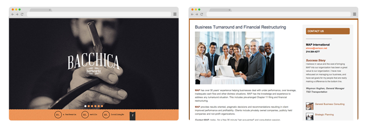
Consider the following two website. Which one at first glance draws you in and demands your attention? Yep, Bacchica definitely drives this one home.
Usability tests from the Nielson Norman Group have done a good amount of research on how users pay close attention to photos of real people but completely ignore generic stock photos. Don’t use these photos!
So before you purchase any photograph, ask yourself the hard questions:
- At first glance, what does the image convey?
- Considering your target market, does your photo represent the same audience? If you’re trying to sell to an older audience, but have an image of a teenager modeling a product your target audience will feel completely out of place & leave your site.
- Is the image high quality? Make sure it’s not blurry or low-res.
Another tip is to use photographs in context. Selling a product? Use photos of the product being used.
Download our own personal curated photography resource list here.
Use Visual hierarchy to communicate effectively.
As soon as you land on your website, what’s the first thing you eyes move towards? What’s the second element? Have a clear strategy in what you want your user to read first, second, third and so forth.
This goes back to having a plan for how you structure your content. Establish the goals of each page and lay out your content and imagery in ways you feel those goals will be accomplished.
Then, use hierarchy to draw attention to the appropriate places. Mint.com does a great example of this.
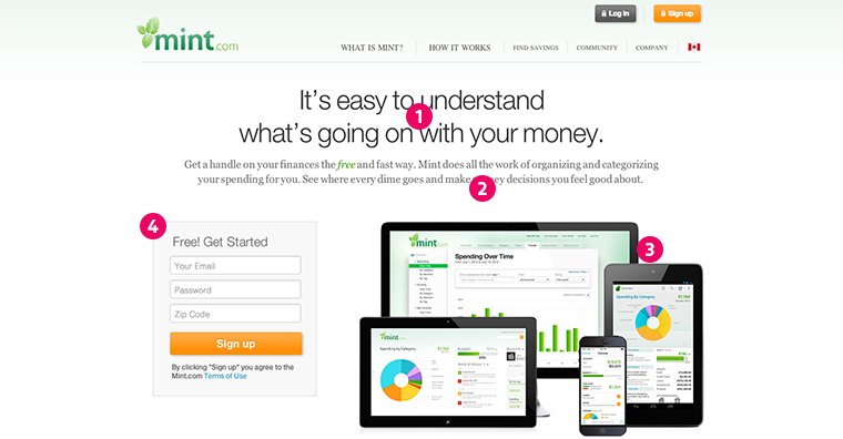
Content and imagery is placed exactly at the first size and place to guide me through the page. With a call to action right at the end of it; great use of visual hierarchy.
Don’t over use an excessive amount of colors, use whitespace and keep it clean and minimal.
Don’t overload your website with random colors. Many of the most effective sites use gray scale very effectively and only use about 1-3 colors to highlight important areas of the page.
Remember you want to have a clean layout that focuses on your service or product. When artist showcase their work they use either a black or white backgrounds because they don’t want to distract viewers from the work that is being presented - the same approach should be considered on your website.
Also, don't be afraid of whitespace! What’s important about white space is that it helps give importance to what really matters. The Less is More concept is definitely the case here. Understand that the more space is being unused, the more attention is given to what really matters on the page.
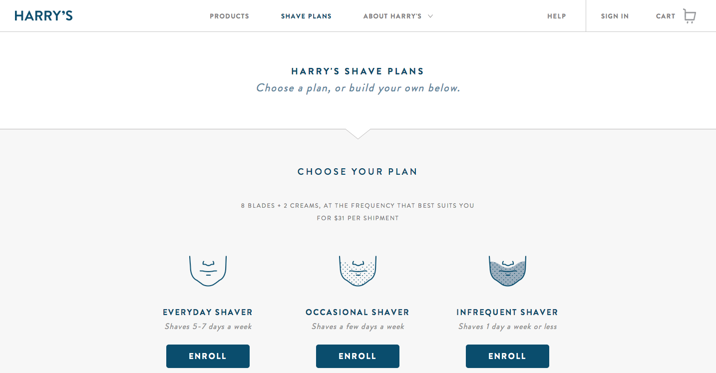
Consider Harry's website for example. Their subtle use of gray scale, the accent of elements using color, and use of whitespace is a perfect example of a clean and effective layout.
Write Content that communicates the benefits your product/service provides.
Ensure your content is clear and straight to the point. Headlines, sub-headlines, and body copy should not be extensive and should clearly communicate the benefits your service or product provides.
Don't bombard your homepage with content everywhere either!
Here’s a good outline for how to structure your home page’s copy.
- Headline: Rule of thumb is have an intriguing headline that captures your desired audience’s attention. Try to keep it under 6 words.
- Sub-Headline: Your sub-headline should be EXTREMELY descriptive and informative. Avoid trying to sound sexy or smart. Be as clear and straight to the point as possible as to what your service provides or what you’re selling.
- Body Copy: Outline your 3 core benefits. What is the value added from your product/service.
The navigation is clear, well organized and does not overwhelm.
Ensure your navigation is not overwhelming. Best rule of thumb is to simplify your navigation as much as possible. Remember when I talk about whitespace and less is more? Ok, that implies here too.
We talked about guiding the user through your site; be selective and organize your navigation in such a way that’ll drive the user to a specific page. This is called User Flow. :)
Also, Make it easy for users to find the About Us, Contact Us, and Home links. The most important factor in having an effective website is to make the site as easy as possible to navigate so users can easily find what they are looking for.
Body copy is easy to read.
Content on a page should be no less than 16 pixels. Take a note of that.
Make your website responsive.
Have a great mobile and tablet experience. About 50% of your traffic is coming from mobile so be sure to not lose out because your mobile site sucks. We talked about it here.
That being said; it’s best practice to simplify your mobile layout as much as possible. With responsive design you also have the capability to restructure what is being displayed on mobile verses on tablet or desktop.
Consider this in providing a better mobile experience. What you want is to do away with irrelevant content and only keep what’s important.
Ask yourself the question; "if I’m viewing my website on mobile, what’s the first thing I’d want to see?"
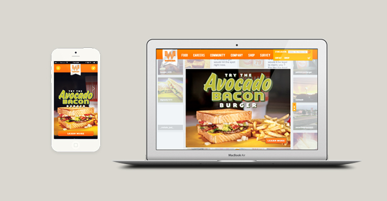
I've noticed restaurants do a good job of this; here's my all time favorite.
Increase website speed
Optimizing your images for web.
Google frowns upon having heavy images on your site! Make sure to use the correct file formats for the images you are using. For images with only a few colors use a .gif or a png-8; where you can select the number of colors you use on your site.
If you’re saving images with an extensive color palettes; use .jpgs or png-24. Overall make sure your file doesn’t exceed 300kbs.
Google Speed checkers.
At the end of it all; use Google Speed Developer Tools to check your score and follow the instructions to increase it. Google uses this tool to rank how well your website does on the internet.
Think of it as a multiplier to your SEO (Search Engine Optimization, aka Google Ranking).
- Google Score on Website HIGH (100) * SEO efforts = GREAT RESULTS :D
- Google Score on Website LOW (1) * SEO efforts = SAD RESULTS :'(
The website loads within 3 seconds.
There’s multiple things you can do to optimize your website. Check your servers, and pay for faster and better ones. Make sure your images are compressed. You can also reference WebPage Test which is a free resource that gives insight into how you best increase your website speed.
Why do you want to have a fast loading site? Here are some shocking statistics to keep in mind:
- “47 percent of consumers expect an ecommerce page to load in two seconds or less”
- “3 second rule - 57 percent of online shoppers will wait three seconds or less before abandoning the site”
- Waiting time for information retrieval is approximately 2 seconds. Though, adding feedback, like a progress bar, can push tolerable waiting time to 38 seconds (so if your site is slow, add progress bars or equivalent).
- “8% cited slow loading pages as a key reason for abandoning their purchase.”
Drive Traffic
Blog about everything.
Blogging is definitely one of the best tools you can use to drive traffic. It’s important that you develop a content strategy of what you should focus your blog on, then write as much valuable content as possible.
This is how the saying Content is King came about. It goes without saying that having important resources and valuable content that’ll drive traffic to your site is important.
Useful and relevant content will also increase your ranking on Google, which is what you want. ;)
Social Media.
If you’re using social media to promote your company - which you should. Integrate your social media on your website.
A great tool to consider is a social media aggregator, which will allow you to collect and publish all your social media accounts in one feed. I recommend this one.
Alright, that's it ladies and gentes. I hope you have found this resource useful and will consider my advice.
If you have any questions feel free to comment or if you'd like a free consultation email me directly! My email is luisedtr[at]createthebridge.com.